

Some art movements treat color as a supporting player; a handful made it the whole show. From the broken light of Impressionism to the pure hues of Fauvism and the loud graphics of Pop, this is a tour of the major styles built on bright, high-key color, what drove each of them, and how their palettes still shape the walls we live with.
Table of Content
- Why Some Movements Chased Bright Color
- Impressionism and Broken Color
- Fauvism: Color Set Free
- Expressionism and Pop Color
- Living With Bold Color Today
Why Some Movements Chased Bright Color
For centuries, European painting kept color on a short leash. Academic training prized fine drawing, sober tones, and smooth blending, and bright hues were used sparingly. That began to change in the nineteenth century as new paint tubes, brighter pigments, and fresh theories about how the eye perceives color gave painters both the tools and the confidence to turn up the intensity.
The result was a run of movements that treated a bold, saturated palette as the main event rather than a finishing touch. The chart below sets out roughly when each of these color-forward styles arrived.
When Bold-Color Movements Emerged
Source: The Met, Heilbrunn Timeline of Art History
Impressionism and Broken Color
Impressionism opened the door. Rather than blend pigments on the palette, its painters laid small strokes of pure, unmixed color side by side, letting the viewer's eye fuse them into shimmering light. Shadows were painted in blues and purples instead of black, and the whole surface seemed to glow with reflected sun. It was the first widely embraced style to put luminous, high-key color ahead of careful detail.
Fauvism: Color Set Free
Fauvism took that freedom to its limit. Around 1905, Henri Matisse and André Derain shocked Paris with canvases in which a face might be split by a green stripe and a river might run scarlet. Critics called them "wild beasts," yet the Fauves used bold, arbitrary colors and crudely simplified forms on purpose, cutting color loose from any duty to describe the real world. A hue no longer had to match nature; it only had to feel right.
The movement lasted only a few years, but its core idea, that color can carry meaning on its own, became a permanent part of modern art.
Expressionism and Pop Color
German Expressionism ran parallel to Fauvism, using clashing, high-intensity color to project anxiety and raw feeling. Decades later, Pop Art picked up the loud end of the spectrum from a different source: commercial printing. Warhol and Lichtenstein are celebrated for exploring the relationship between fine art, advertising, and consumerism, and their bright oranges, yellows, and purples came straight from billboards and comic pages. The palette shifted from the emotional to the graphic, but the volume stayed high.
Living With Bold Color Today
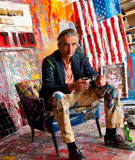
These movements left a lasting mark on how we decorate and how we see. A single boldly colored canvas can reset an entire room, which is one reason color-forward American art remains so popular. The paintings of Steve Penley Art carry this lineage forward, applying thick, saturated color to national subjects in a way that reads at a glance from across a gallery.
That bright palette also sits at the heart of much American imagery, so it helps to know what Americana really means as a visual language before hanging a piece.
Related reading: browse the Americana collection, trace the story in Americana art history, and meet the famous Pop Art artists who made loud color respectable.